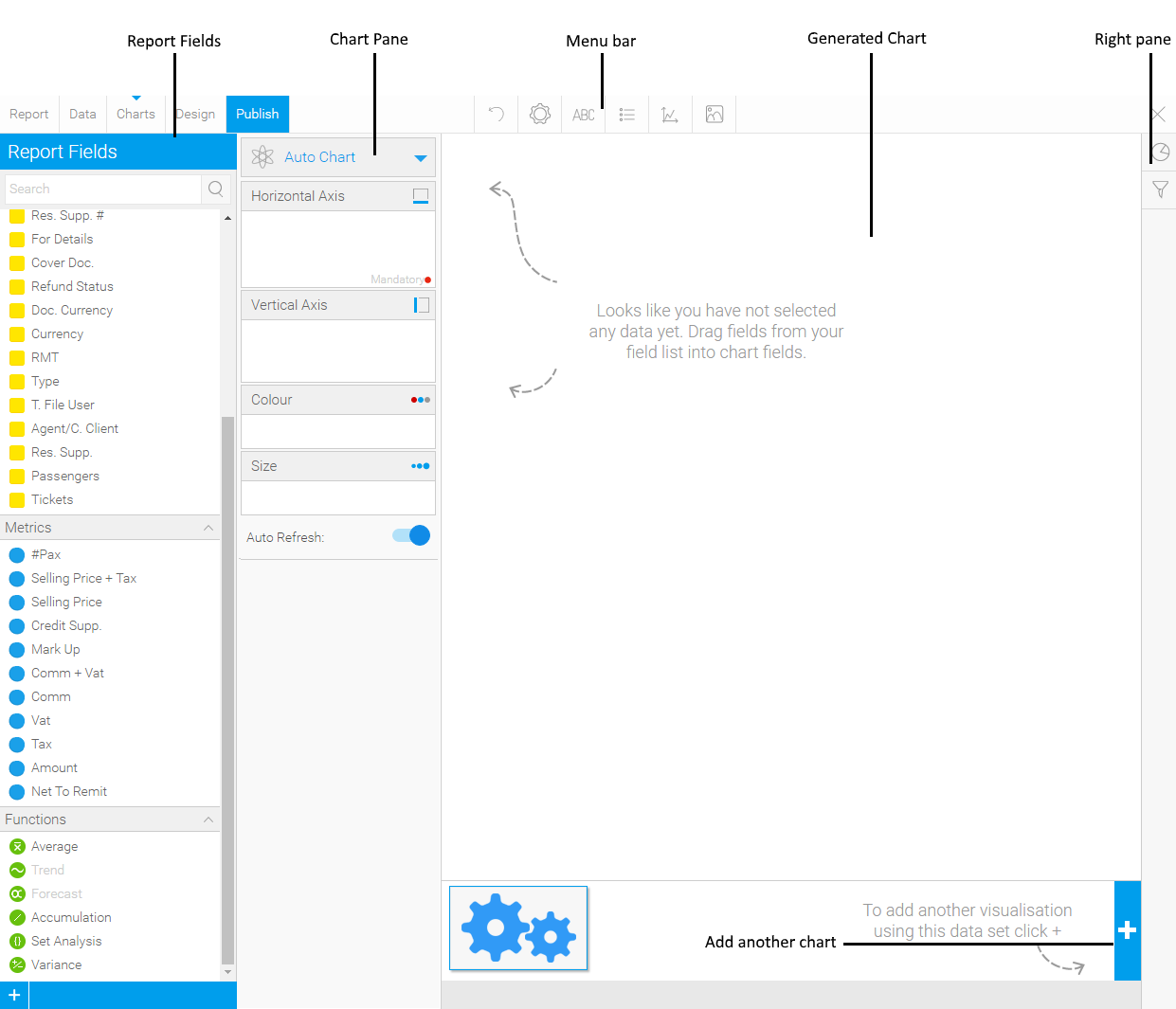
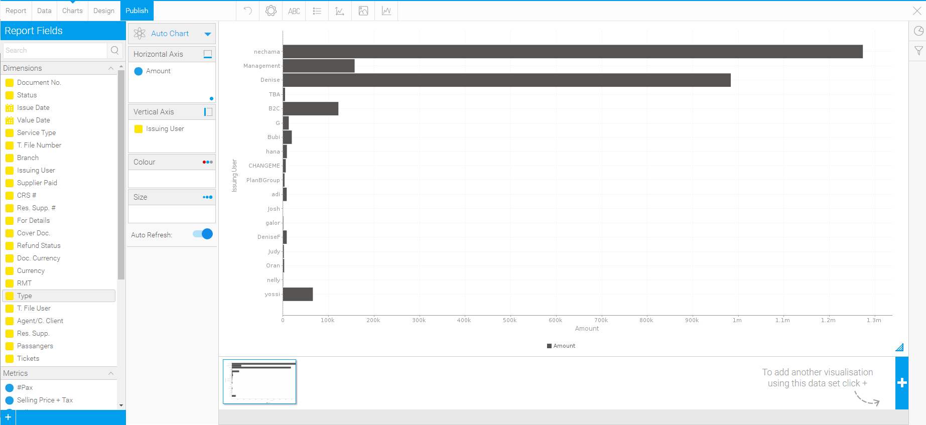
In the Report Fields, drag the chart fields to the Horizontal Axis and Vertical Axis panes.
|
There are three types of chart fields:
For more information on functions, see the Yellowfin Online Help |
The chart is automatically generated.
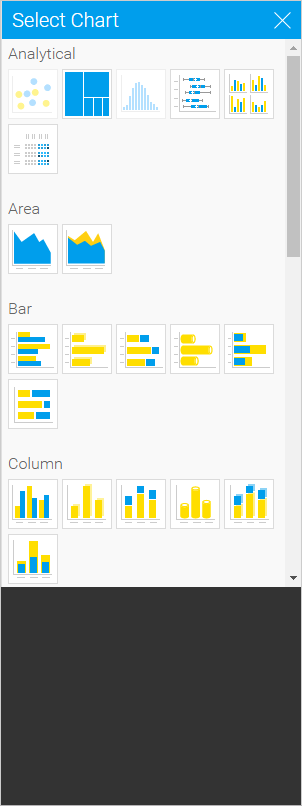
To change the chart type:
In the Charts pane, in the Auto Chart menu, click the blue arrow (
 ),
and select Select Chart Type.
),
and select Select Chart Type.In the Right Pane, click the Select Chart (
 ) button
Click on the chart type you want to create.
OR,
The Select Chart pane is displayed.
The chart is automatically refreshed.
You can use the menu bar to further customize the chart the following actions on the report:
Menu bar option |
Description |
Click this button to undo the most recent change made to the chart. |
|
Click this button to open the Chart Settings pane in which you can:
The formatting options are different for each chart type. Note: You can also edit the size and position of the chart in the design tab, |
|
Click this button to open the Title pane in which you can edit the chart title, and title formatting. |
|
Click this button to open the Legend pane in which you can:
|
|
Click this button to open the Background pane in which you can edit the formatting of the plot and chart areas. |
|
Click this button to open the Labels pane in which you can choose whether to display labels for the individual values in the chart. |
|
N/A |
|
The formatting options are different for each chart type. For more information on chart customization and chart series, see the Yellowfin Online Help |
To continue working on the report return to the Data tab. The chart is automatically saved.